Reviewing financial data can be a tiresome and repetitive process. In many cases it involves looking through page after page, row after row of numbers. It gets even more complicated when you’re trying to review data side by side or to filter out specific information. It is also hard to present. Either you have too much data and your audience end up walking out more confused or with more information than they needed, or you felt like you were in a tennis match, swapping back and forth between reports or screens to provide a bigger picture story.
For many years it was common to distribute monthly financials via Excel files, which enabled entry of data from multiple reports and presentation of a visual narrative. On Excel we could create graphs to highlight the information that we wanted to review monthly.
But even if all the reports were in Excel format, it was still a lengthy process to input the data into a template, create graphs and visuals to display the data and then update the file each month with new numbers so that revised graphs could be populated. Over the years we found ourselves pulling other data into the files so we could create more graphs to supply information from additional sectors or from different viewpoints.
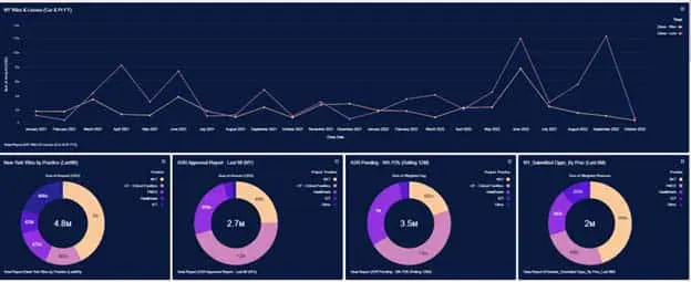
CRM to the rescue! We started with a new CRM platform in 2020 that allowed us to produce the firm’s lead information accounts and opportunities in not only list reports that could be exported into Excel, but also into graphs that brought this information to life. Seeing a hit / loss ratio at the bottom of a list gives us the details we need, but seeing the data shared in a graph tells a story instead. Even better, the reports were live … no more inputting data from multiple reports into additional files to produce the same results.
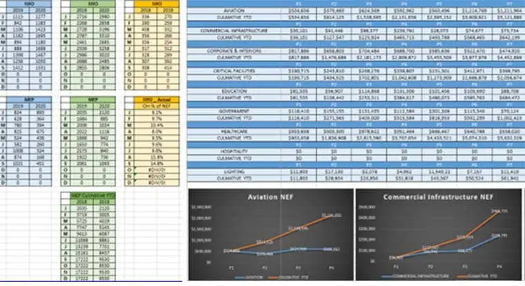
Then new accounting software was added in 2021, bringing our project and accounting data into the system as well. Now we could run a multitude of different reports both on the customer relationship platform and on the project management and financial platforms.
Even more helpful were the capabilities for viewing reports. Yes, we could view natively or export them to Excel for distribution, but we could now create dashboards where multiple graphs could be viewed at once. Want a deeper dive? Each graph has a link to the report so during a meeting or viewing you can click on the link and see the other data in a report list format.
Gone are the tennis match reviews, the back and forth between reports to get all the information. Now we have a central hub where we can customize the reports we need, filter as required and then lay them out on a dashboard in a format that allows us to tell our story. The art of showing the right amount of information in the right manner without superfluous information is a daily challenge, but one we are certain we can conquer.
Stay tuned for our next article as we chronicle our journey into creating our own data warehouse for all our software systems and our efforts to perfect the art of dashboarding!